It’s frustrating when you spend countless hours on a website that doesn’t seem to yield results. You’re researching, you’re editing, you’re picking pictures all the time, and nothing is getting through. You’re still left with no subscribers and no new traffic. No worries! I have some tips on how to improve your website to capture the clients you need.

My name is Lucian, and I’m the founder of IMM; and I have been a website developer since 2004. I know how the internet and marketing have changed over the years, and I’ve learned a thing or two about building a captivating website. In this article, I will share 10 tips on how to increase conversion and achieve more sales.
For your benefit, I have broken these tips down into three sections, Design Improvement, Text and Copy, and Conversion Optimization, so that you can follow these simple steps to creating a better business.
Design Improvement (website design 2022 tips)
Tip 1: Remove the Clutter
I know that there is a desire to guarantee that your potential customer knows everything about your business, but sometimes this leads to clutter. The truth is, you only have a few moments to capture an audience’s attention, 15 seconds to be exact. In these few seconds, you want to make it easy for them to locate what they’re looking for.
It would be best to have simple navigation, one headline, one message, and one call to action. That’s it. These four things can help you turn a potential customer into a buyer/subscriber, which is the goal.
Tip 2: No Image Slider

You should never have a banner slider or a carousel image. Conversion experts have completed research saying that 90% of people don’t get past the first slider. This is because they cause distraction and make your intended client forget what they were searching for. Remember, you only have a moment to capture their attention, and you want to make it count.
It would be best to have simple navigation, one headline, one message, and one call to action. That’s it. These four things can help you turn a potential customer into a buyer/subscriber, which is the goal.
Tip 3: No Stock Photos
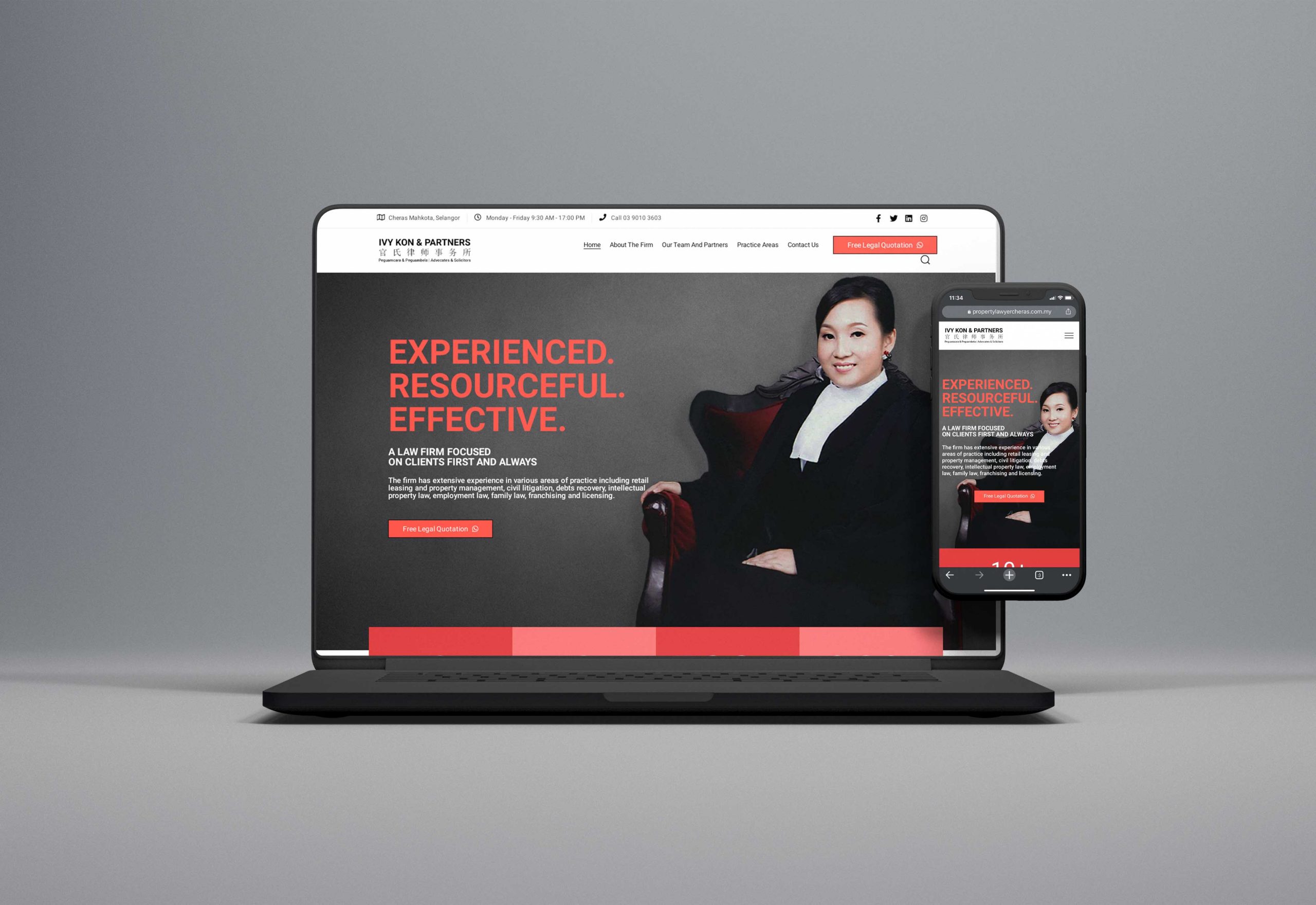
While it may be tempting to grab a stock photo, it portrays the wrong message. The biggest mistake being that your customers may think you’re fake because they’ve seen that image on several other websites. Images are silent sellers and, most of the time, do the talking for us. Your image should express you and your brand, which can’t be found in a stock photo.
Something as simple as changes your images and increase conversion. Hire a local photographer to take a photo of you, your product, or your company team. This will show that you’re real people and instill trust. You can also hire a graphic designer to do your web-banner editing to make sure it speaks your business’s message.
Tip 4: Remove Social Media Icons
You may not understand this tip at first because it makes sense to link all your sites in one place. However, giving your client social media options instantly sends them away and off to other platforms and users.
The primary goal of even having a business social media page is to create engaging content that leads people to your website, which leads to increased sales. Not the other way around. The purpose of your website is to provide an outlet for people to purchase your good or services. The bottom line, social media icons doesn’t benefit you on the header portion of your page. Place them in the footer or contact us page as additional resources for your business.
Text And Copy (website design 2022 tips)
Tip 5: Don't Use Jargon
Your website should be simple to read for your clients. This means you should look at it from a perspective that anyone should be able to understand. To achieve this, you have to stay away from slang terms and lousy grammar. Your grandma and your son should both be able to read your page and understand it with ease.
Copy on your website should be basic, coherent, and in short sentences. Where possible, provide quick bullet points and summarize.
Tip 6: Improve Your Headline

The two items your visitors will see within the first 5 seconds is your image and headline. That means if your headline is dull and boring, they won’t be staying for much longer. Your headline should be benefit-centric; think, “What’s in it for them?” It’s always good when designing a website to put yourself in the shoes of your visitor. Acting as the client, think of what you look for when visiting sites.
To create a great headline, think of these questions:
“What is the problem they come to you for?”
“How does it make them feel?”
“How can I help fix their problem?”
Tip 7: Too Much Text On Your Website
I hate to break it to you, but most people don’t read the entirety of the text on your website. People usually tend to quickly scan, gloss over, and look at the headlines. People go to your website to solve a problem, and they’re looking for keywords that resonate with them. Instead of focusing on lengthy posts that might bore the reader, focus on having benefit-centric posts and precise engaging copies
Conversion Optimization (website design 2022 tips)
Tip 8: Confusing Call to Action (CTA)
For the final few tips, I will share with you the secrets only known by industry professionals. These are all about Conversion Optimization, how to attract the right client at the right time.
- Your call to action should be clear, direct, and precise. No Nonsense.
- The “Learn More” or “More Information” is not a CTA button. To tell you the truth, visitors don’t want to learn anything more. They want you to fix their problem.
- The most important duty of your CTA button is to answer, “How do I get it?” “How do I but it?” Good examples of this tip would be, “Schedule a call.” Or “Get a Quote.” Both of these phrases help direct your client into a sale.
Tip 9: Annoying Pop-Up
For this tip, it’s important to note that we’re not entirely against Pop-Ups. When they are placed in the right position, they serve a place. For example, right when a visitor is about to leave the site, a Pop-Up comes up to remind them of a call to action.
However, when a Pop-Up is random and doesn’t serve a purpose, it is simply distracting for your visitors. Especially if they are actively engaged in your content, and a Pop-up appears and annoys them. It completely reverses what you put it in place to accomplish
Tip 10: Not Enough Testimonials / Way too Many Testimonials.

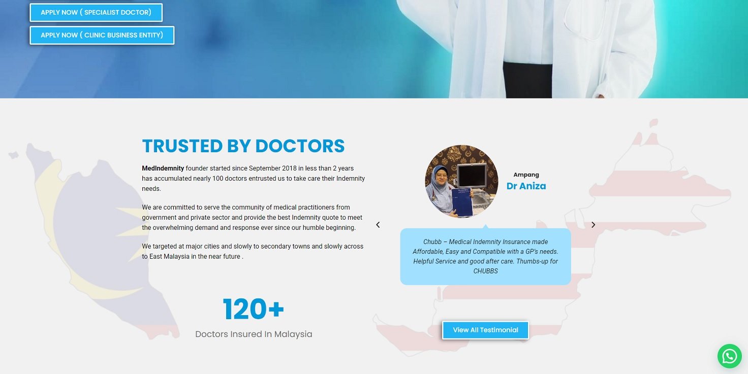
When people look into testimonials, they search to find out what people like them have to say. They are looking for both the good and the bad, but they also understand that no proper business person would ever place a bad review on their site. They look to find similar people with similar problems that your product has solved, and they want it to feel real. A great way to increase credibility is by putting a photo and a name with the review. Adding a real person that has benefited from your services can inspire your visitors to want the same.
Conclusion:
Having a beautiful website is important, but so is having one that drives your business and lets you expand. It’s essential to adjust your website to your visitor’s needs.
Actioning these simple tips above can drastically increase traffic and lead to a big pay off. Take the tips that I took years to learn and build a customer-centric page. You will notice how your business improves and how sustainable it becomes.
Schedule a call at 0163887880 if you’re interested in letting a professional take a look at your website. Let us do some magic and revamp your website so that it’s as ready for business as you are.


